Filip de Blois
Making complex information clear.
As an information designer at the PBL Netherlands Environmental Assessment Agency, I translate complex science and policy-related subjects into clear visualisations.

As an information designer at the PBL Netherlands Environmental Assessment Agency, I translate complex science and policy-related subjects into clear visualisations.
Visualising Knowledge for Policy
Effective data visualisation at the science-policy interface is more than just making charts look appealing; it is about bridging the gap between complex research and actionable insight.
Co-authoring Visualising Knowledge: Lessons from 25 years of data visualisation for policymakers reflects my core approach: combining scientific accuracy with narrative structure and design clarity. By engaging early in the analytical process, I turn intricate spatial and environmental data into accessible stories, interactive visuals, and strategic infographics.
Rather than maintaining a static online archive, I keep my latest projects, publications, and professional updates active on my LinkedIn profile.
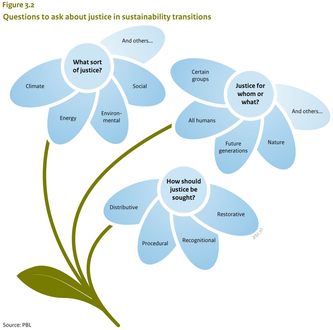
Translating complex climate, spatial, and environmental research into clear, high-impact data visualisations for national policymakers.
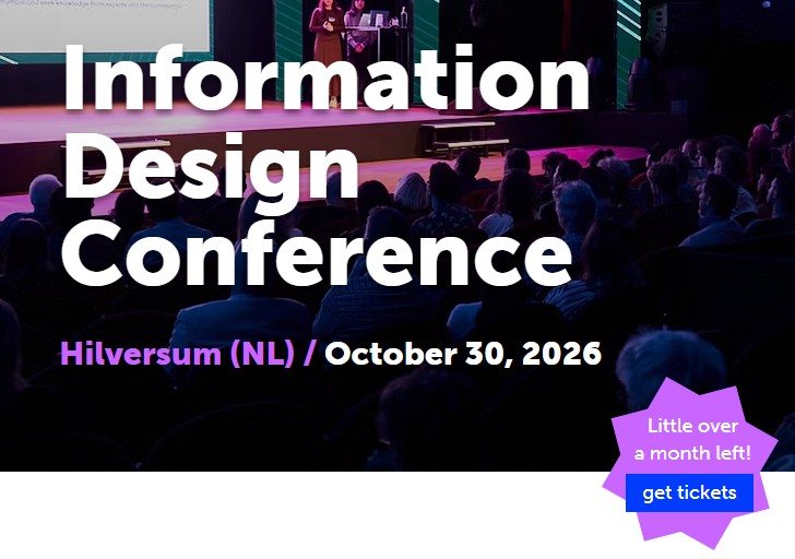
Co-organiser of the annual conference uniting information designers, journalists, researchers, and visual communicators worldwide.
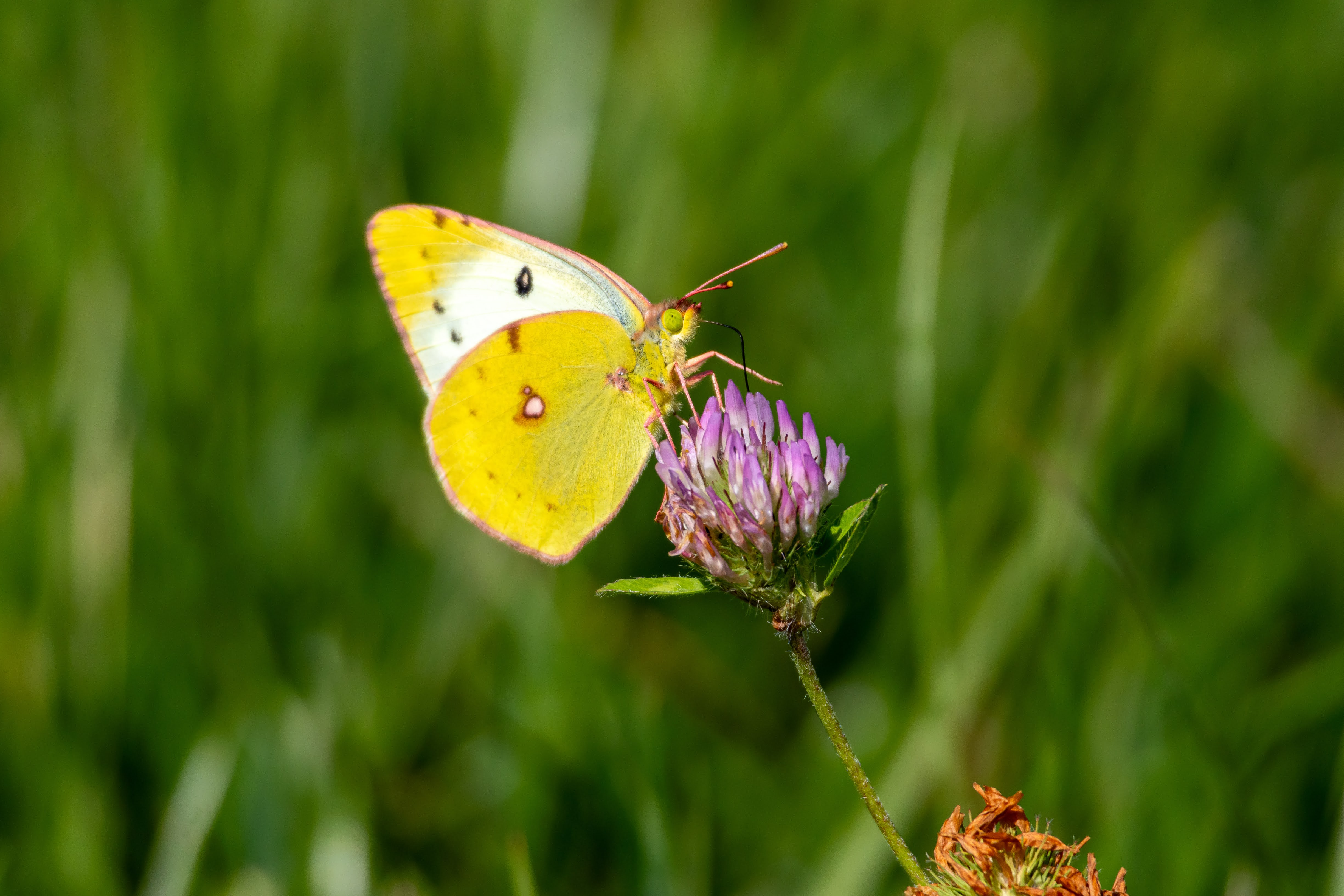
Exploring light, timing, and atmosphere through low-light, sports, portraits, and astrophotography. Refining a keen visual eye beyond the grid.